Inside McMansion Hell
An interview with Kate Wagner, the ugly-house blogger.
To fully appreciate McMansion Hell — Kate Wagner’s biting and hilarious blog skewering those “ugly houses that became ubiquitous before (and after) the bubble burst” — one needs to understand McMansions. To understand McMansions, one needs look no further than Wagner’s McMansion scale, aka the 10 Circles of McMansion Hell. The graphic is representative of the blog as a whole: aesthetically lo-fi, but thoroughly considered; accessible to laypeople, but clearly created by someone read up in architectural theory.
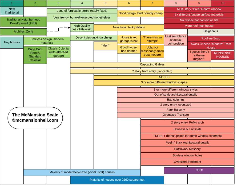
Wagner is a 23-year-old grad student researching acoustics at Johns Hopkins. Anyone familiar with her blog — primarily real estate listings annotated with her chastening commentary — will recognize the colloquial efficiency of the categorizations she’s created. For the sixth circle of McMansion Hell: “House is ok, garage is not.” Circles eight through ten: “More roof than house.” Circles seven through ten: the all-caps “TURRET.” (Turrets, like columns, excessive roof lines, and illogical windows are common objects of Wagner’s disdain.)
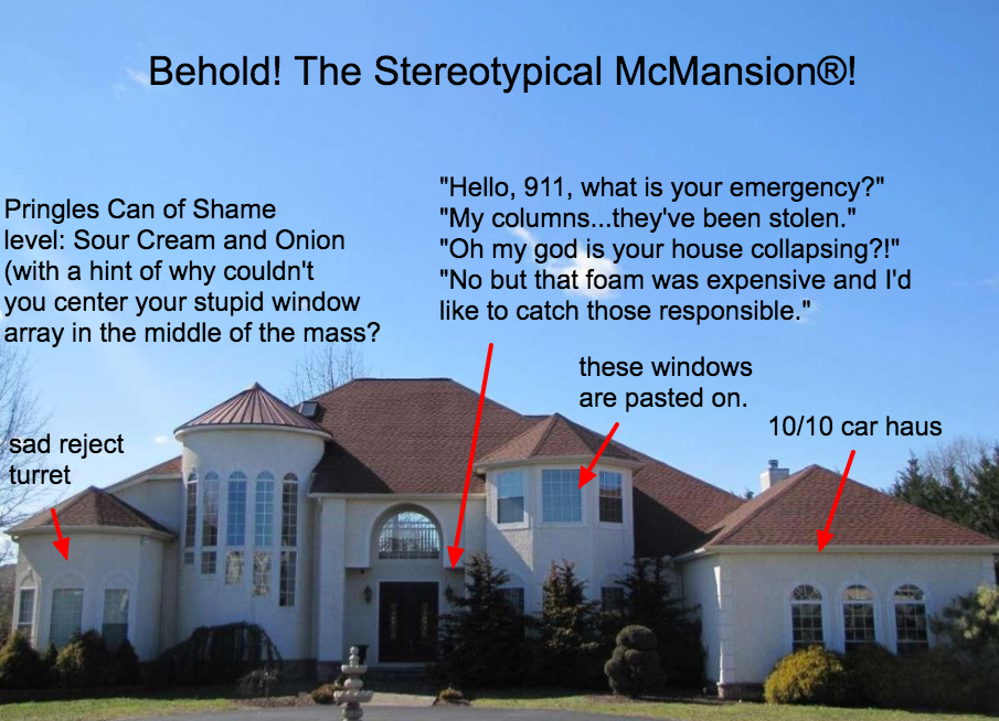
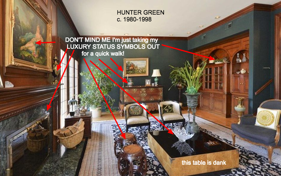
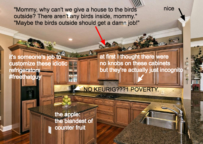
It’s a satisfying explainer for those who hate these sprawling suburban houses but maybe haven’t been able to articulate why, but it’s also genuinely educational. Spliced between photos calling out excessive windows in New Jersey (“scream holes”) and useless status symbols in Delaware (“what is the point of tray ceilings SERIOUSLY though”) are primers on architectural history and theory, and a regularly updated master list of further reading. It honestly might be your new favorite blog.
I got Wagner on the phone and talked about the driving (angry) passion behind McMansion Hell — where her interest began, how these houses became ubiquitous, and why she’s totally fine with tearing them apart.
Tell me a bit about the background of McMansion Hell.
Kate Wagner: I started the blog in July 2016, basically because there weren’t really any good ugly house blogs. I didn’t think anybody was going to pay any attention, but then I wrote this piece on the blog called Why McMansions Are Bad Architecture and it kind of went viral. I don’t know how, but it did, and then suddenly I started getting tens of thousands of people following my Tumblr. I’m in the middle of putting together a book proposal and working as a writer for several other publications, so this sort of kickstarted a career for me, which is really awesome, honestly. I’m really grateful that it happened.
It seems, as a reader, that an important factor of your success is that you’re obviously really knowledgeable about what you’re talking about. You’re able to point out, to people like me who might not know why these houses are so off-putting, what exactly makes this kind of architecture and design bad. That’s something you study, right?
KW: I study architectural acoustics at the Peabody Conservatory at Johns Hopkins. My thesis is a taxonomy of concert halls. I’m trying to get a PhD so I can write a book about concert halls.
Have you always been interested in architecture and the functionality of design?
KW: Yeah, ever since I was a little kid. I rode the bus in North Carolina — in Southern Pines, which is about an hour south of Raleigh — and my sister and I were the first ones to get on the bus at 6:30 in the morning, and the last to get off in the afternoon. The whole time I was looking at houses and trying to picture the lives of people who came out, trying to see how the houses were different from each other, and being really fascinated with the ones that were a little funny looking. I was an HGTV junkie as a kid. I loved watching Candice Olsen on “Divine Design”; I was always really into “House Hunters.” I started writing about postmodern architecture in high school, for classes but also privately. That was the easiest way for me to get into architectural theory. Now my horizons are a lot broader, but honestly, reading Learning From Las Vegas in high school was what got me interested in the idea of writing about architecture from a theory standpoint.
The blog is so funny, but there is real, evident anger behind it. What bothers you about what you’re seeing?
KW: First of all, I hate the wastefulness of it. You don’t need that much space. These houses are just so horribly constructed; they’re huge energy sinks, part of a completely unsustainable lifestyle, which is also driven by the car and the isolation of suburbia and exurbia.
Then, the pretentiousness of it. It’s appropriating architectural languages of the past, like certain types of columns, in order to denote an appeal to authority, architecturally. By putting columns on your front door, it’s saying you have the same amount of power as an institution like a bank or government office. We’ve codified certain symbols as symbols of wealth. But that started a long time ago, and it’s a whole other can of worms. Now, though, the cheapness of the material — there’s an irony there for me. It’s making this bold statement of wealth, but you can’t afford to do it with good stuff.
Also just the roof lines bother me the most. [Laughs.] They make no sense, and they’re huge, and they’re at so many different pitches, and anyone who knows anything about roofs knows the more complicated the roofs are, the more likely they are to leak. Can you imaging re-roofing a house like that, after ten or twelve years? It would cost more than buying a new house.
Looking through the pictures on your posts, you start to realize how consistent these markers are. Like, I’d never noticed how many windows are on these houses. How could you need so many windows? What are some of the elements you see again and again?
KW: Usually the roof lines are the number one. The windows not matching, or there being too many windows, or windows in illogical places. That’s pretty common. The use of foam architectural detailings. I don’t know how trendy this stuff is; it was pretty trendy in the 2000s, but some of it has gone a little out of style. Vinyl siding is pretty much out of style now, but that was a marker.
I honestly think it’s the size of the houses. The two-story entryway. They’re not scaled at all to the human being. For me to stand in front of this house would make me feel so small, and I think that’s part of the point. They’re not homey, because they’re just so huge.
All of these things are sort of codified throughout the blog. I devised a scale of how McMansion-y something is based on certain architectural features, as a way to taxonomize. That no one has really done so is interesting to me. I wouldn’t say it’s vernacular architecture — which is designed and built by the people who would use it — because there are huge corporations, lots of industry, money, lobbying involved. But it is uneducated. There’s so much American housing that hasn’t been studied in any sort of academic way, and of course the blog is not the way to examine that, but it’s part of a greater research project of mine, which is to document the changes in American housing in the last 40 years, architecturally and economically and sociologically.
The tagline of the blog describes these homes as coming before the bubble burst. Can you talk a little about the economic environment that led to this surge of McMansions?
KW: I think the financial crisis and McMansions — there’s no causation. It’s all correlation. When markets are good, people build houses that are huge. That’s why the average housing square footage has gone up yet again this year. When markets are good, people buy huge houses, and they’re not going to stop until that way of life is no longer sustainable financially, which means we run out of oil.
What happened with the financial crisis is that because of the riskiness of the loans that were being lent at the time, you saw more people borrowing more money than they could afford, to build houses that were too big for what they needed. They were risky assets the entire time.
You’ve looked at different countries on the blog, but this aesthetic does kind of feel specific to the U.S. Is that real, or do I just think that because I’m here?
KW: I’m only now starting to study the McMansions of other countries because there’s so much to study in my own country that I could never run out of material, but I think the main differences are in size. In Canada, the house are just a little smaller. They’re still ugly and stupid, but they’re not quite as huge. Australia, for at least a couple years, had larger house sizes than the U.S. But also it’s hard to navigate the real estate listings there so it’s hard for me to get a bigger picture of the what the average is for those areas. Since I haven’t been to those places, I can’t get as good of a feel of how their suburban landscape is different from ours. But I plan on visiting eventually.
Could you identify states here that are the worst offenders?
KW: Oh yeah. If I’m just like, oh, I need to find a good McMansion right now, my go-to places are northern Virginia, southern Maryland, the D.C. suburbs. New Jersey — all of it. The whole thing. I find some pretty heinous ones in the southeast in general. Marietta, Georgia, is particularly horrible. Colorado’s pretty bad. Texas, always. Texas ’til the end of time.
That makes sense, everything bigger in Texas.
KW: Texas is particularly horrible.
Have you had to deal with angry or offended readers?
KW: I’m still waiting for someone to be like, “That’s my house!” but no one has yet.
That’s good.
KW: No one’s ever even been like, “You’re wrong. I hate this, and you’re wrong.” Which is hilarious, because I totally expected that to happen, since the internet is evil.
You are in a sort of rare position to not be getting hate for something you’re doing on the internet — which is probably a good sign. Do you ever feel bad, though, about tearing apart these places which has been or will someday be someone’s home? Or is it more like, listen, make a better house and I won’t make fun of it.
KW: It’s not like it’s a witch hunt. I’ll include the city or the county, but I never link to the real estate listing. I try to be vague about the square footage and the price so people can’t just look it up. I try to give them privacy in that way. But I think that I don’t particularly feel bad because the people who build these houses obviously have enough wealth where they don’t really need to care, honestly. I don’t want to be deciding factor between someone buying a house or not buying a house, but at the same time, these houses are so exorbitant and so stupid that I feel like they’ve already been sitting on the market forever, and nothing I say is going to change the fact that they’re not really wanted. They’re just so huge and so expensive and so bad. But also I just don’t feel bad at all, really. (Laughs.) There’s a reason I don’t crap all over apartment complexes, because people live where they can afford to live. But at a certain point you’re not living where you can afford to live; you’re living in excess.
Do you see a reversal in the trend? It feels like people are embracing minimalism, but that might just be my own urban bubble.
KW: In architecture, yeah. You see the tiny house trend, and younger people tend to do less. I read somewhere that my generation and the generation before care more about experiences than assets. Their idea of having a good life is doing things like traveling and living in the city rather than having a huge house and a nice car and all of the things that for so long was the sort of American ideal. Technology also changes things. When you live in a world with such pervasive technology, which in some ways is erasing borders, there’s no room for tribalism or any of the things that keep us locked in one place. So I think minimalism is definitely appealing to the financial situations of young people who are saddled with debt, or it’s appealing to people who get more from doing things than from having things.
But still, people ask me all the time if the McMansion is going to die, and I know Business Insider wants it to die so bad and I appreciate them, but it’s not. Fewer people are buying old, but more people are building new. That’s sort of what’s emerged as the trend.
There will always be people who want a huge house.
KW: For a lot of people, their idea of personal wealth and success is a huge house. Is there something wrong with that? I’m a super environmentalist, so I would say yes, of course there’s something inherently wrong with having and creating this huge waste of space. But at the same time, it’s still somebody’s home. If that’s their dream, then that’s their dream. I’m not going to insult that person specifically; that’s why I make up characters. But no, it’s not going to die until that way of life is unsustainable, until people literally cannot afford to live that way. And the only way that can happen is if we run out of oil. Or Florida falls off into the ocean.