State Flag Trivia
by Caity Weaver

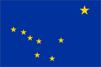
1. Alaska’s flag was designed as part of a contest held in 1927, 30 years before the territory became a state. The winning submission was drawn by Benny Benson, a 13-year-old boy of mixed European and Aleut heritage. Like all cartoonishly named 13-year-old boys of that period, Benson lived in an orphanage and probably had a lot of moxie and spunk. As his reward, he received $1,000 toward a trip to Washington, D.C. to present the flag to President and fellow alliterate Calvin Coolidge, as well as a white gold pocket watch engraved with his design. While the Washington trip never transpired due to scheduling conflicts, Benson was able to apply the funds to his education at a diesel-engine repair school. The pocket watch, which he later donated to the Alaska state museum, was extremely boss.
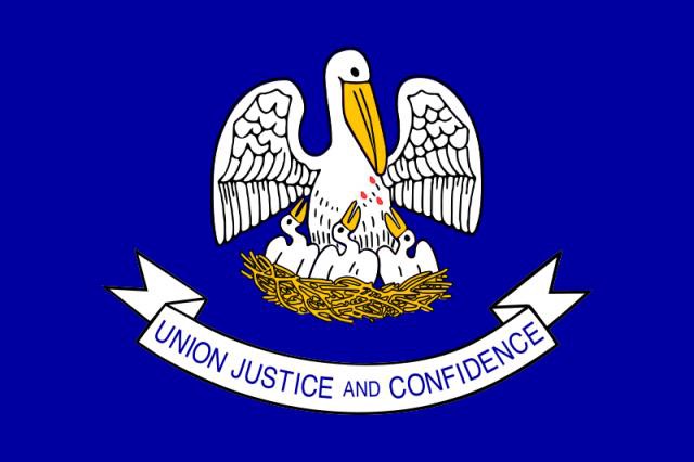
2. The focal point of the Louisiana state flag is what’s known as “a pelican in her piety” or, in layman’s terms, “a deranged suicidal pelican killing herself to feed her vampire young.” The symbol is actually derived from a Christian allegory dating back to medieval times — a sort of avian take on the Passion of Jesus. In some versions of the pelican legend, a paternal bird inflicts mortal wounds on his offspring in response to their incessant pecking at his chest. Aggrieved by his actions, he pierces his own breast with his beak (the technical term for this action is “vulning” in case you want to impress or irritate your friends) and the blood he spills revives his birdie babies. In other accounts, a maternal pelican draws her own blood with the express purpose of feeding her young — a particularly sanguine form of breastfeeding.
A less bloody i.e. less cool version of the current flag was used in Louisiana from 1912 until 2006, when an eighth grader named Joseph Louviere noticed that the three drops of blood present on the original version of the pelican flag had disappeared in subsequent decades. He contacted his local representative (and presumably also the Vampire King of Louisiana, William Compton) to protest the change, and shortly thereafter presented his findings to the Louisiana House Judiciary Committee. The bill to re-add the three red markings passed unanimously in both the Senate and the House. A victory for blood everywhere.
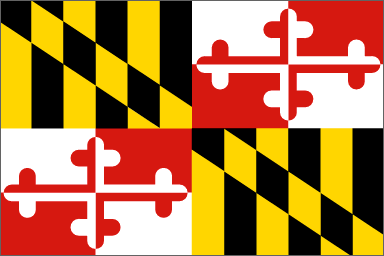
3. Maryland’s state flag is an excellent example of how to honor conflicting Civil War sympathies without throwing a huge Stars and Bars up the flag pole because, what are you, the Dukes of Hazzard or something? Like many East Coast things, the flag has fancy, fancy roots: Its distinctive design is lifted from the family crest of George Calvert, the first Lord Baltimore, who adopted a coat of arms that included a shield with alternating quadrants of yellow-and-black (to honor his paternal roots) and red-and-white (for his maternal side: the Crosslands). While the modern flag has its basis in the pre-Revolution days, the design fell out of use between the period of independence and the US Civil War. In 1854, the crest made its reappearance on the Maryland state seal, and yellow and black banners, called “Maryland colors” or “Baltimore colors” gained popularity throughout the state. Because the yellow-and-black design was associated with the state government and, therefore, with Union allegiance, Southern sympathizers living in Marlyand adopted the red-and-white Crossland colors as their own. Following end of the War, a flag incorporating alternating quadrants of both sets of colors began appearing at public events: a symbol of reunion.
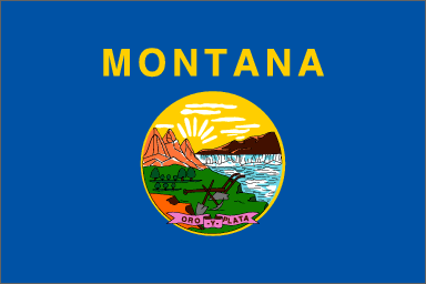
4. The seal depicted on Montana’s flag is more remarkable for what it doesn’t contain than what it does. The original design, first proposed by representative Francis Thompson a couple decades before the territory achieved statehood, featured some manmade tools, some natural wonders, and, to make it spicy, a little bit of Spanish gibberish. When drawing up his proposal, Thompson had intended to include the Spanish phrase for “gold and silver”: “oro y plata.” Unfortunately, what he came up with was “oro el plata,” which basically translates as “gold the silver,” except that “plata,” being feminine, takes the article “la,” so actually it was wrong on top of being wrong. (An alternative state motto, “Montana: Wrong to Infinity,” was never proposed.) Luckily, someone with rudimentary Spanish skills caught this in time and a seal looking basically as it does today (“oro y plata,” a miner’s pick and shovel, some ~*~ montañas ~*~, etc.) was adopted.
Then, in 1889, Montana became a state, and the territory seal was no longer good enough. Legislators wanted to add more.
Specifically, they wanted to add Indians. They wanted to add settlers. They wanted to add horses, and sheep, and cattle. They wanted to add miners. And a buffalo. And a train. And a stagecoach. They wanted to add a picture of every person who had ever lived in, been to, or heard of Montana. They wanted to add a scaled-down puff-paint version of Michelangelo’s work on the Sistine Chapel ceiling. They wanted to add the lyrics from their favorite Hannah Montana songs but no one could agree on which ones were the most powerful. Basically, they wanted to turn the dial up to 11. Before any of these changes could be implemented, the men involved realized how cracked out and impossible to look at such a flag would be and left well enough alone.
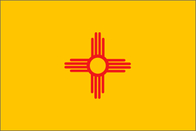
5. While, thanks to Ke$ha, appropriation of Native American cultural iconography has never been hotter, the New Mexico state flag has been working the trend since 1925. The design, which features the sacred Zia sun symbol, was proposed for a contest by Dr. Harry Mera, an archaeologist from Santa Fe. Mera had seen the symbol on a 19th-century water jar excavated from the Zia pueblo, on display at the New Mexico Museum of Art. He chose to depict the image in red and yellow to honor the colors of the Spanish Crown of Castile.
Several decades later, in 1999, the 850 members of the Zia pueblo demanded $74 million from the state of New Mexico for the use of their sacred sun symbol on the state flag. (The figure represented $1 million for each year the design appeared on the flag, up to 1999.) According to tribe administrator Peter Pino, the pot that inspired Mera’s design was stolen property: Only ceremonial pottery was allowed to bear the Zia, and no ceremonial pottery was ever to leave the pueblo. Tribal officials claimed that, by filing the lawsuit, they hoped to raise awareness for the lack of legal protection offered to Native American groups regarding use of their sacred symbols. That mission may have been accomplished, but they never got the $74 million.
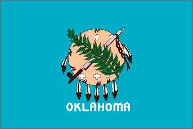
6. The official state salute to Oklahoma’s flag explains its design best: “I salute the Flag of the State of Oklahoma: Its symbols of peace unite all people.” The flag’s dominating feature, a buffalo hide Osage warrior shield, appears behind cross-cultural symbols of peace: a ceremonial peace pipe (to honor Native American populations and their ancestors) and an olive branch (to honor European-American settlers). The field of blue on which the central design floats is borrowed from the blue flag carried by Choctaw soldiers who fought on behalf of the Confederacy during the Civil War.
Take a look at a real life Osage shield, then recreate your favorite obscure Civil War skirmishes with the Choctaw Brigade toy soldier set.
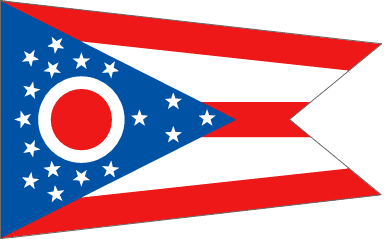
7. For Ohioans, the 1901 Pan-American Exposition was an old timey wooden rollercoaster ride of emotions. President and buck-eye state native William McKinley was assassinated by an anarchist: terrible! Ohio’s state flag made its first appearance: hooray! A new invention called the X-ray machine was on display: science! That flag, by the way, wasn’t shaped like a rectangle: what! But its unique “swallowtail burgee” design was patented by the architect who invented it: alright!
At the time of its adoption in 1902, Ohio’s flag held the distinction of being the only non-rectangular jurisdictional flag at the state level or above in the world. This reign lasted until 1962, when the country of Nepal unfurled an even more nonrectangular national flag. (Theirs is made of two pennons*.) This stealing of Ohio’s thunder prompted a bitter, bloody rivalry between the two lands that rages to this day. Ohio is home to the Rock & Roll Hall of Fame and leads the U.S. in production of Swiss cheese, though, so suck it, Nepal.
*Wikipedia identifies “pennon” as “the vexillogical word for pennant.” Make sure not to confuse the two when speaking about the flag of Nepal in polite company.
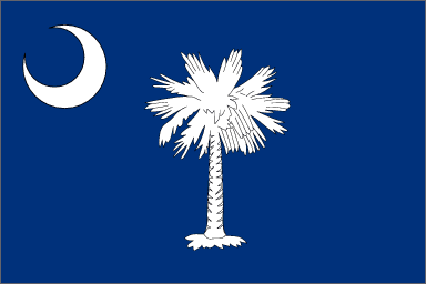
8. The white palmetto on South Carolina’s flag was chosen to honor the tree’s significance to the American Revolution, a conflict which resulted in the creation of the United States. Ironically, it was added to the banner to form the flag of the Republic of South Carolina just after the state seceded from the United States in 1861. The legend of the palm dates back to one morning in June of 1776, when British naval forces began attacking a partially constructed American fort on Sullivan’s Island, off South Carolina’s coast. This fort, later re-named Fort Moultrie in honor of the commander of the battle fought that day, was constructed of the palmetto wood native to the island. Rather than splintering when hit by cannonballs, the spongy palmetto logs quivered and absorbed the impact of the daylong bombardment. By 9 p.m., the British had given up but the logs hadn’t. Proof, once again, that exhibiting doughy weakness is a viable defense strategy.
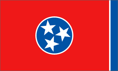
9. Perhaps the most noteworthy feature of the flag of Tennessee is the thin blue bar located on the far right section of the flag. “Oh my,” you think to yourself, as your eyes are sucked deeper into the navy void. “What deep, philosophical meaning does this gash of blue signify? The perpetual presence of discord in an otherwise utopian state? An uneasy concord between Democrats and Republicans? A River Styx on the border of Hades?” The answer, as provided by the flag’s designer, LeRoy Reeves of the Third Regiment, Tennessee Infantry:
The final blue bar relieves the sameness of the crimson field and prevents the flag from showing too much crimson when hanging limp.
So, just that.
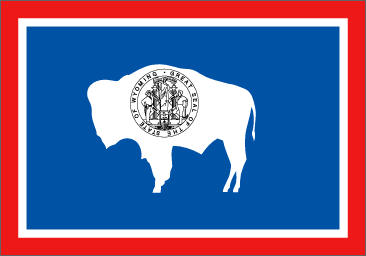
10. In 1916, the Daughters of the American Revolution sponsored a contest to design an official flag for the state of Wyoming. The winning submission, chosen from 37 entries, was contributed by Verna Keyes, a recent graduate of the Art Institute of Chicago. Fifty years later, Verna presented an epic retelling of the events leading up to the design’s creation. [The bitchy friend she mentions was a college pal visiting from Ohio.]:
Silently I had been pondering over the various possibilities for the design and was awakenend from a sound sleep one night and there appeared to me a clear, complete and perfect design for the flag. I wakened my friend in great excitement, telling her I knew exactly what I would draw. She was uninterested and sleepily mumbled something incoherent about not caring. The following morning I drew the design as it had been revealed to me that night; such inspiration reaffirms the true Source of all Creation. [emphasis added]
In contrast to the version currently in use, Verna’s original design featured a bison facing away from the flagpole. For an explanation of this detail and its subsequent change, we turn, again, to the creator:
My reasoning on this was that the bison once roamed freely over the plains of Wyoming and I thought he should so fly on the flag. Dr. Hebard [Professor of Political Economy at the University of Wyoming, and state regent for the Daughters of the American Revolution — a.k.a. The Man] did not agree with this and thought it would be better design and balance to have the bison facing the staff.
For her work, Verna received $20.00.
For a thorough (super, super thorough) breakdown of the flag’s symbolism and adoption, see Verna’s complete statement.
Previously: Sometimes State Flags…
Caity Weaver just graduated from the University of Pennsylvania with a degree in Linguistics. She is an asset to any quizzo team.