Urban Outfitters Continues to Be Bad at Fonts
by Liz Colville
Urban Outfitters, as you may have noticed, launched a new logo a few weeks ago — ISH — the revamp would surely not pass muster among any talented branding people, because it’s not complete or cohesive, and the words don’t even fit in the space allocated to them. Doesn’t matter I guess, because now the website’s banner looks different again. For the holidays alone? The pumpkin spice latte of holiday shopping? Who knows.
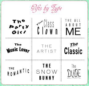
Perhaps Urban Outfitters was inspired by that other hideous logo that swept in and out of our lives around the same time. Anyway, despite changing the main logo again, URBN continues to use its kind of drunken, sixth-grade-computer-class font design scheme across the site, and pictured. It certainly inspires something, but not to buy anything from them, not even giant gummy worms. What comes to mind, rather, when I look at these bingo squares:
The Party Girl: A girl who likes to randomly scream or start singing in public, and for some reason her friends LOVE HER FOR IT.
The Class Clown: A yearbook “Superlatives” page on the class clown.
The All About Me: A Swedish film about 20-somethings.
The Music Lover: A flier for a “Bluegrass Wednesday” event.
The Artist: Promotion material for the film I Am Love, or an editorial spread of Tom Ford lying completely naked except for a bowtie and with a lion cub in his arms.
The Classic: Nothing. Dead.
The Romantic: Credit sequence for The Love Boat.
The Snow Bunny: Blake Lively buying a Christmas tree, wondering why the F it’s taking so long; come on, Ryan Gosling is waiting in his town car, thinking about What An Incredible Actress She Is.
The Dude: Some young man you know who is so scraggly and vague in speech that he doesn’t seem all there, a kind of sketch of a man, perhaps a Roz Chast character, not worthy of strongly drawn lines.